One of the current needs of web design is making it suitable from PC to mobile device. Thus comes the responsive web design, one of which, Twenty Eleven, for WP was chosen by me to install for my blog.
And it’s free.
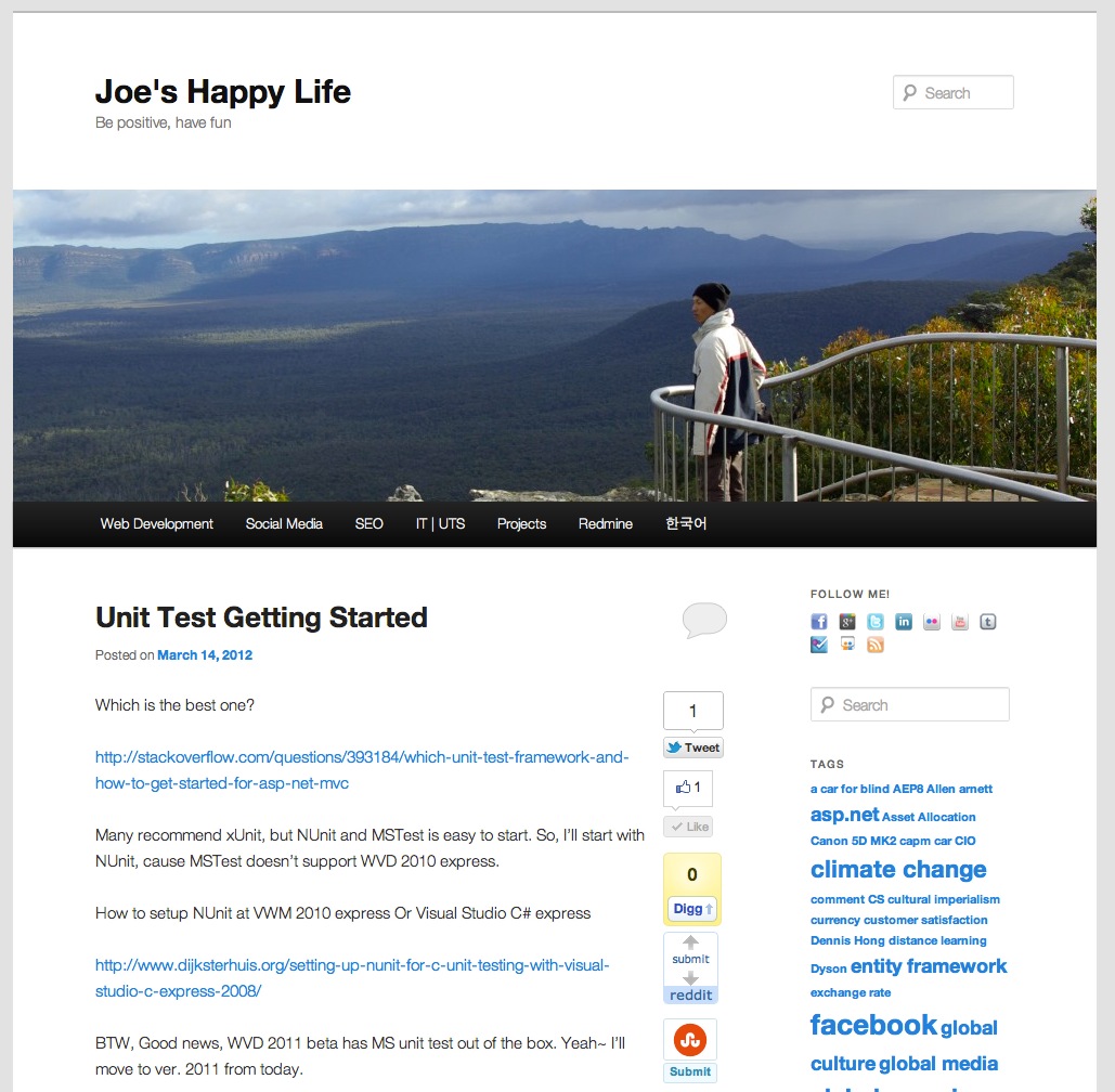
What has happen after the installation is as follows;
It’s just normal when it just installed.
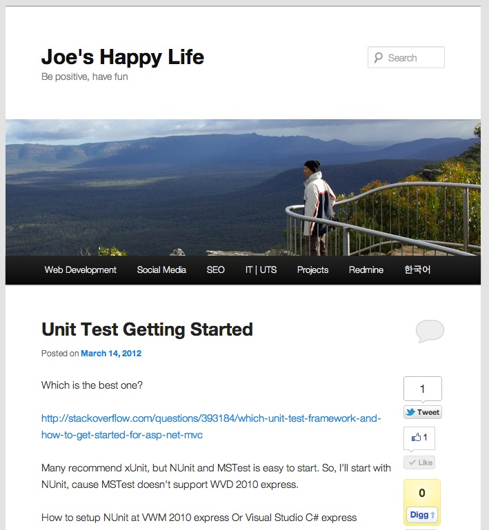
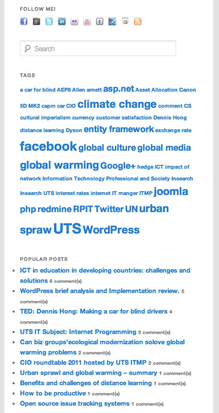
When the screen size is shrunken, the main image is shrunken accordingly and right hand side column is disappeared and placed to the bottom of the blog.
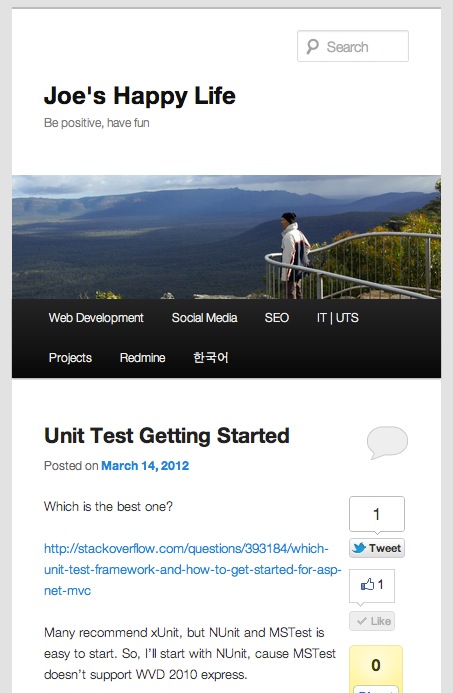
When the screen size get even smaller, text font get smaller accordingly. This automatic way of transformation of layout looks really good for mobile device like ipad, iphone and other tables. Given growing volume of mobile traffic, responsive design is amazing for web site owner as individual or corporate.
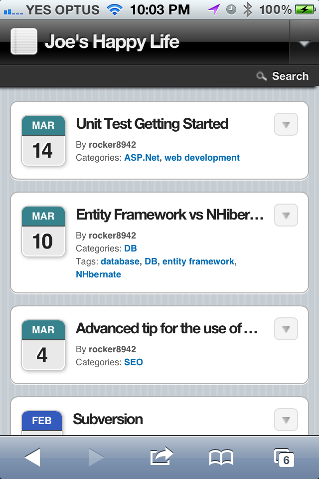
This is the same page on iphone. However, this is not the responsive transformation of the same template, but iphone specific plug-in added in my blog, which will replace the template for desktop screen when user access my blog using hand held device like iphone.
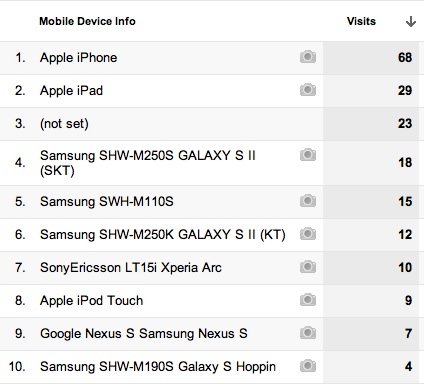
As a bonus, this is the mobile traffic to my blog in last month, which is definitely growing. Another amazing thing is the total number of visitors to my blog through mobile device is 29% of total number of visitors.
This is the right time to invest in to meet the need of mobile visitors to any web site.
